Wednesday, 1 December 2010

Research and Planning: Opening to The Dark Knight.

Opening to The Dark Knight.
Camera Shot/Angle/Movement/Sound
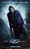
Shot – there is a lot of shots in the beginning of The Dark Knight and they change shots very fast. The shots that are used are aerial shots, so we get a feel of the location, mid-shots and long shots of the characters so we can see who they play. The director also uses some master shots so we can see the explosions that dominate the scene.
Angle – in the opening of The Dark Knight, the director uses high angles so we can see characters and explosions dominating the scene, and there is also eye level angles used, showing the drama of the characters and situations.
Movement – the director uses a pan movement to show a wider view of the location and to give a sense of expanse. It also tracks some of the characters for a few seconds. There is also crane movement, giving the reaction of a crowd as they run away in fear.
Sound - The sound is only hear able until about 20 seconds into the opening scene. This gives a very dramatic effect when the music does come on. It is a very dark and dramatic soundtrack to go with the scene’s the director is showing in the opening scene. The music starts to get quieter as the scene comes to an end and the title of the film is shown on screen, so we know that the film is about to start properly.
Editing and Mise en Scene.
Editing - The opening scene is made up of scenes of the film, so these have been cut and put into the beginning so the audience gets a sense of the characters and what they are like, these scenes have been edited into each other and put together so we just see short snaps of the characters and explosions so it does give too much of the film away, the editing is just used so we get small ideas and then it is moved onto a new clip.
Mise en Scene - In the opening scene, the text on the screen saying the names of the actors sometimes dominates the scene, and in the background the audience can see what character the actor plays and from the background the audience get a feel of the protagonist and the antagonist. The background consists of car crashes, explosions, chase scenes, fighting and much more which the audience can tell that this film is full of action.
Characters/Location/Narrative/Plot/Themes/Visual Style/Genre.
Characters – The characters are clearly shown in the opening scene to The Dark Knight, as they are clearly presented in the text and from the clips that are shown, we see what actor plays which character and we can have an idea of the protagonist due to the costumes they are wearing and the make-up that is used.
Location – Aerial shots are used so we can see where the film is located. Showing buildings and streets and people help the audience see where the scene is being set.
Narrative/Plot – From the opening scene, the audience can get an idea of what the film is about, as many people have seen previous films or heard about “Batman” and “The Dark Knight” not much clue’s need to be given about the story.
Themes – The themes of this film are revenge, jealousy, murder, death, we can tell the themes by the conventions in the opening credits.
Visual style – The Visual Style of The Dark Knight opening shows the darkness of the film, the scenes are mostly all at night so we can see that it is not a comedy or a happy film.
Genre – The Genre of this film is clearly shown by the opening credits, it is all at night so it is very dark which gives the audience an idea that the whole film is very dark and not a happy film. The conventions in the film also tell us there is action in the film by the explosions and chase scenes and the violence in the films. This shows us that it is a thriller by the antagonist clearly shown by the costumes, make-up and by his actions in the opening credits.


Research and Planning: Opening to The Shining

Opening analysis to The Shining.
Camera shot/Angle/Movement.
Camera shot: In the opening scene of the shining there are many shots used to show the audience that it is a thriller however the main shot that is used pretty much throughout the whole opening 3 minutes is a aerial view shot, where we are looking down at the moving car. Also another main shot is the establishing shot, because it informs the audience where the movie is going to be taking place and also gives the audience a good clear picture of the setting.
Angle: In the opening scene of the shining the most common angle that gets used is a high angle. It tracks the car on the road throughout the whole three minutes of the opening. The high shot dominates the scene and gives the audience a feel of what is happening, the ‘bigger picture’.
Movement: In the opening scene of the shining the director wants the object to dominate the scene. In this case the object is the car which we see driving on the road. Track movement if used within the first three minutes, to track what’s happening and give the audience a bigger idea and picture to what is happening.
Sound/Editing/Mise en scene.
Sound: In the opening scene of the shining the way that the director informs the audience that the movie they are watching is going to be a thriller is by using conventions. One of the main conventions in the opening is sound. The director uses a fast paced beat of a song which the audience would automatically pair up to a thriller, the music suggests secrecy to the audience and maybe some confusion to what is going to take place in the movie.
Editing: There are not that many cuts within the opening of the shining. The time that the editor cuts is when the car turns a bend or a corner. Creates a sharp feel for the audience, and makes them want to continue watching also.
Mise en scene: In the opening scene to the shining the Mise en scene is very effective because the way the long shot is used, captures all of the mountains and lake scenery suggesting that was going to be part of the main setting for the film.  The Mise en scene definitely contrasts with the music that the director has used, due to the surroundings and lakes being all peaceful and the music having a strong mysterious beat to it.
Characters/Locations/Narrative plot.
Characters: Within the opening scene there is no actual shots of a person. The only shots we get in the opening is of the surroundings and the moving car who has someone in it but the audience are not shown who was in the car.
Locations: Due to the Mise en scene that is used in the opening scene of the shining, we know that the place where the movie may be set is in the mountains and in a calm place like that. The audience are not shown any other shots in a different location to that, therefore the only location shown to us is the mountains.
Narrative plot: The audience are not really given an idea of what the plot of the movie is going to be about. The way the car is continually in the opening could maybe suggest that there is going to be a fair bit of travelling, but minus that the audience are not given many ideas to come to a conclusion of what may be happening.
Themes/Visual style/Genre.
Themes: In the opening of the shining the audience cannot really figure out a theme for the film. However due to the conventions that the director uses, we are able to tell that one of the themes will include mystery.
Visual style: Overall in the opening scene the way that the director has presented some of the conventions gives the audience a brief idea of what may be occurring within the movie. The sound, which personally I think is the biggest convention of horror in the opening, gives the idea the idea and thought of confusion.  Leaves them feeling unease about the film, which is what the director was aiming for.
Genre: Due to the conventions in the opening of the shining, the audience can tell it is going to be a horror. However the director could have definitely added more conventions in to make it a bit clearer to the audience. At the moment the main give away is the sound, it tells the audience something may be happening which shouldn’t.

Research and Planning: Opening to Panic Room

Opening to Panic Room.
Camera shot, angle and movement.
Shots - The opening scene of panic room contains alot of wide and aerial. The effect of these shots gives the audience a wide view of what is going on in the scene and also where the scene is located.
Angle - The director uses high angles alot of times to dominate the scene and it also gives the audience an idea of what is going on below. Also the director used low angles, this could be added to give the effect of the largeness of the buildings maybe making the person who is watching it feel small. 
Movement - The director uses pan movement which gives the audience the feeling of expanse and a wider view of the location and setting of the opening scene. 
Characters, Location and Narrative/Plot.
Characters - In the opening scene for about a minute there is no characters present, it is not until the last 20 seconds that two characters are introduced to the audience with a walking dialogue. 
Locations - In the opening scene the audience are straight away told that the film is going to be filmed in New York, time square due to the fact that there are lots of shots of buildings within Time square.
Narrative/Plot - The audience is not given no idea of what the plot or story line is going to be about in the film. The opening shots are of buildings. However due to the punchy music played in the background, the audience could guess that its going to be maybe a thriller, and that something interesting is going to be happening within the movie.
Themes, Visual style and Genre.
Themes - It’s hard for the audience to tell what the main themes are going to be for Panic room. The normal conventions of a horror are not as present as they usually are in horror movies. The camera pans the skyline and the high angles gives the audience the sense of being watched. Also the title contrasts the bigness of the city and the little ‘panic room’. 
Visual style - The way that the director uses a very unconventional way of long shots establishes openness and a sense of grandeur. He also uses the buildings to present the actors names this suggests that they are almost part of the building. 
Genre - The audience can tell that the film is going to be a thriller maybe from the title, however the actual opening scene definitely contrasts with the title how the opening is very calm and there is not many horror conventions present.
Sound - The use of sound within the opening scene of panic room creates quite alot of tension due to the punchy beats. It leaves the audience feeling quite uneasy and confused because the music does not really fit in with the calm setting.  The calmness of the setting definitely contrasts with the sound that is used. Towards the end of the two minutes there is a bit of dialogue which contrasts with the calm opening. 
Editing and Mise en scene.
Editing - The way that the director has paced the opening scene of panic room leaves the audience questioning the story line and plot of the film. There is not alot of editing in the opening scene at all which makes the audience feel at ease and leave them interesting and wanting to watch the rest of the movie. However for an opening of a horror there are not all the usual convections present as in other movies, the pace is slow and there are not lots of sharp cuts. The one convection that suggests to the audience that it is a thriller is the music, with the slow but edgy beats that it has to it. 
Mise en scene - In the opening scene, there are many shots of buildings and New York time square, this tells the reader where the film is set. The dull lighting used within the opening also suggests a cold like atmosphere, making the reader maybe feel uneasy and a bit uncomfortable. 

Research and Planning: Opening to Se7en

Opening to se7en.
Camera shot, angle and movement. 
Angle - the low angles that are being used within the opening scene create a feeling of suspense once again. Also leaving the audience feeling uneasy and vulnerable. The use of high shots that are used within the opening scene of seven shows how this unrevealed character is dominating the scene, also is used to show the aspects and slight characteristics of the unrevealed person or story line. 
Movement - tilt movement is used to give the audience a wide view of what is happening within the scene, slow movement also emphasises the feeling of suspense making the audience feel the tension taking place. 
Sound - The use of sound used within the opening scene of seven is one of the main conventions that gives the audience the knowledge that the film that they are watching is a thriller. Non diegetic is used within the opening to once again emphasise that the genre is a thriller. The fact that artificial sound is used also goes to show that the story line has a more deeper feeling than a film that natural sound is used in would have. The way that dysfunctional sounds are used almost imitate his feelings and what is going on inside his head. The way that sound is used within the opening scene gives the audience an idea of what the mysterious unrevealed character that’s dominating the opening scene is going to be like.
Editing and Mise en Scene.
Editing -The effect of so many cuts leaves the audience feeling disorientated. They are unable to focus on any specific objects for a long amount of time. This creates an uneasy atmosphere and gives the audience a brief quick idea of what is going on. The quick snappy cuts that the director uses defiantly fits in with the expectations of the audience about the horror film.   
Mise en scene -The setting is unclear in the opening but due to the activities the agonist present in the opening scene suggests to the audience that the opening is set in the basement of a house.  The darkness of the scene also support the basement idea, also how there is no actual shots of a persons face or full activity it confuses the audience much more and leaves them on edge. The imagery of blood and books also used within the opening scene encourages the idea of death and horror.
Characters, locations, narrative/plot, themes, visual style and genre.
Characters - The audience do not really get a scene where they see a full person but we get an idea of what the character is like by the activities that are taking place in the opening scene.
Locations - The audience can not see again fully where the scene is set but due to the convection's used within the opening credits, it gives the audience an idea that it is possibly set within the basement of a house. They may think this because of the lighting and mise en scene that is used.
Narrative/plot - There is no actual narrative within the opening that we are aware of. The audience can not really get the full idea of what the film is going to be about however due to some of the actions and convections used, they are given a brief idea of what the movie consists of. 
Themes - From the first few minutes the audience can tell that there is a possibility of torture and death. They would gather this idea due to some of the actions that are taking place. There is alot of red colours, suggesting blood which then we can relate to death. The way the person in the scene is cutting up objects, one is doing it in quite a violent way, this relates to torture. 
Visual Style - The way that the director puts together the opening credits supports the visual idea of death. The theme of death dominates the scene due to the way it is presented and most of the objects are based along the idea of death. 
Genre - From all of the present convections in the opening credits of seven, its clearly a thriller however we can argue that it is a thriller-horror, seeing as all the convections of a thriller and horror. 

Research and Planning: Comparision of Se7en and Panic Room.

Comparison of Se7en and Panic Room
Although both of these films are directed by the same person, the openings are very different to each other and the audience gets different perspectives and ideas about each of the films. The director uses very different techniques to open the film. Both se7en and panic room are both thrillers, and in the opening credits they both have conventions that tell the audience this, such as the music. But the main differences in the way these openings are directed are the shots, angles and camera movements that are used. Se7en has a lot of short camera shots that are quick, meaning that the audience does not have time to take in what is being showed on screen, whereas this is very different to panic room where the director uses a lot of wide, long and aerial shots with high angles so we see a lot of buildings and the location of where the film is being set and in se7en it is only showing a house or a basement of a house where there is dark lighting and artificial lighting, and in panic room it is outside so we see natural lighting and it is bright, so we can tell straight away that panic room may have more of a story line and plot and se7en might be more of a horror as it has conventions of a horror as well as thriller. The text on the screen of the names of the actors are also very different, in panic room, they are very big and bold going across the buildings, almost blending in with them, but in se7en the colour of the text –white, contrasts with the background – black, and the text is very small and moves and is fazed so can be confusing to read. The music in panic room is also slow to create a dramatic effect, whereas in se7en the music is faster and represents the insanity of the character and what he is thinking, it is less organised than panic room.

Friday, 19 November 2010

Research and Planning: Children of Men Essay

Children of Men Essay
In the opening of Children of Men, we can see that it is being represented in the future (2027) in a cafe. It is being represented negatively because of the pollution we can see, the busy streets and the natural lighting. This negative representation is being created by the suggestion of death and the news broadcast, also by the alcohol he adds to the coffee suggests he is dependent on alcohol and his life is very depressing. The explosion also gives a negative representation of the future. 
In the opening of Children of Men, the person being represented is the man in the coffee shop, from the opening scene there is a main character but it is not clear if he is a hero as he doesn’t have hero characteristics. He does not fit our established ideas of what a hero should be, he does not go to help people when the explosion goes off, he has no emotion and he isn’t interested in the news about a person being shot and also that he is drinking alcohol in the morning, we would not picture a hero to be like this. In this opening scene, women are being represented as a dying breed, this is taking away what makes them a women, so they are almost seen as useless and worthless in the future. The future is being represented as more digital, there are moving images on the buses and taxis. 
In the opening of Children of Men, there is artificial lightning at the very beginning when he is in the coffee shop but when he goes outside of the coffee shop it is natural lighting. The dark lighting gives a sad effect for the whole film due to the dull colours and polluted air. The audience will get an idea of what the film is like, that it is not a happy film. 
In the opening scene, the camera is an all in one shot, for a major feature (fictional) film we would have expected more camera shots to be used in the opening scene. I wouldn’t have expected the camera to track the man out of the coffee shop and dominate the scene so we see it from his perspective and has a greater impact when the bomb goes off. I think the camera shots have been chosen to get the main character’s perspective and a deeper view of the explosion. 
The camera shot is an all in one shot after the man picks up his coffee, so not much editing is required. Because of the all in one shot, the text that comes across the screen is more visible and powerful to the audience, it also makes it clearer and easier to recognise and read. It doesn’t change the place throughout the clip, the text is informing the audience of where the scene is set and the main plot of the films location. 
Before we see any characters or setting, the opening straight away starts with voices on the news informing viewers about death, this is very unusual and gives a deeper effect of the scene and gives that sad effect for the whole of the film. There are sounds from the streets which overtake the sad and mellow background noise, so there is a shock when the explosion happens. I think the director has done this to get a sad effect, so this sets of a sad tone for the whole of the film and the news reporters make you listen because its different and interesting. 
The location of London is created by the English news reporters; also as he goes out of the shop we can see the red buses which London is famous for and the taxis on the street.